Healthy Futures
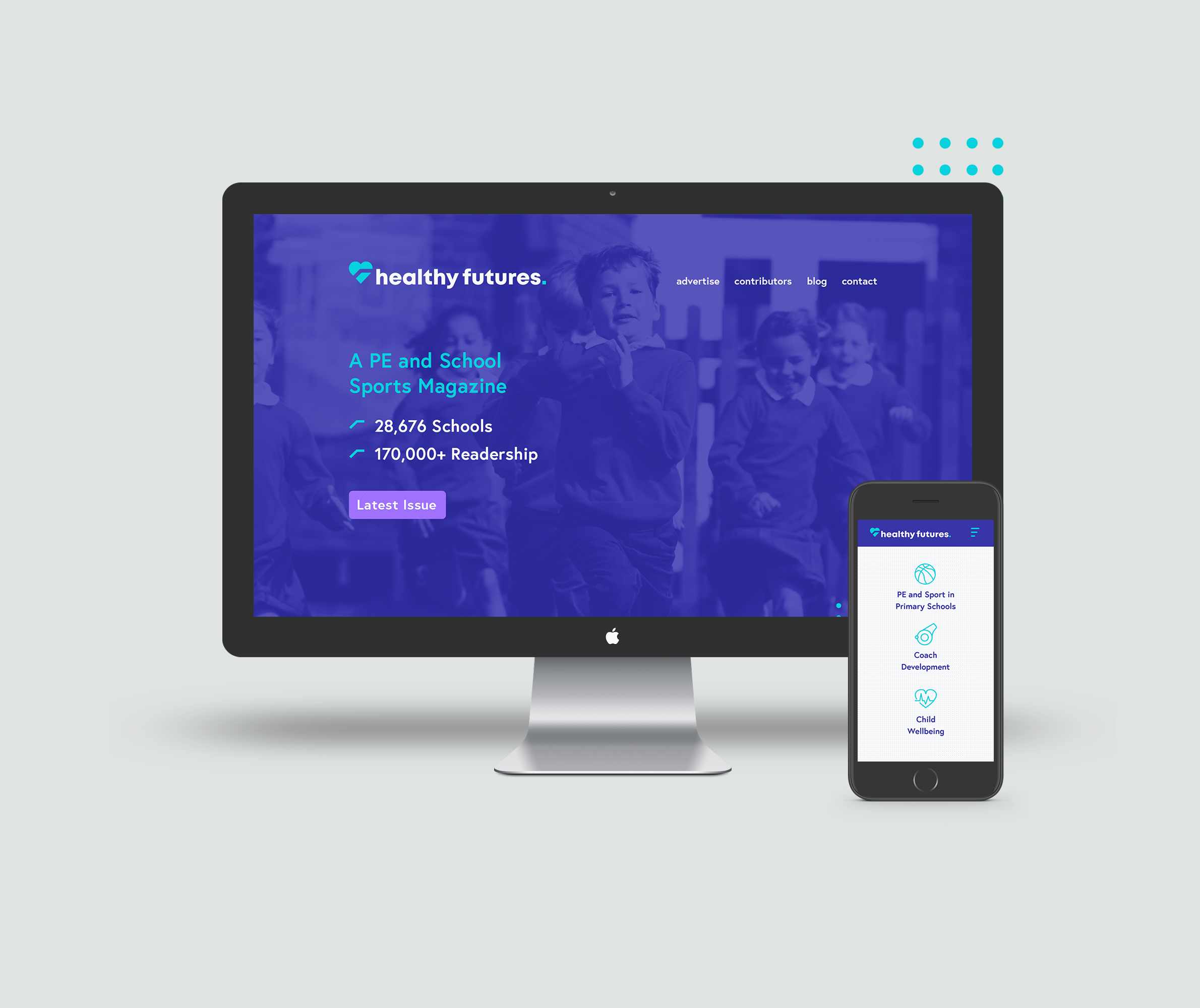
Healthy Futures is a PE and school sports magazine with a reach of 28,676 schools and a 100,000 + readership.
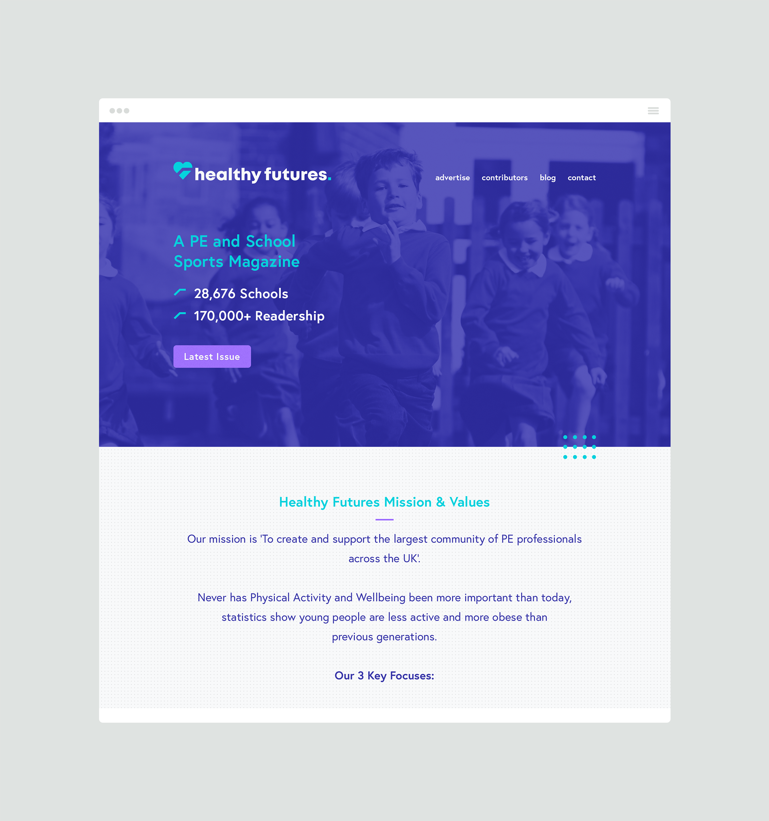
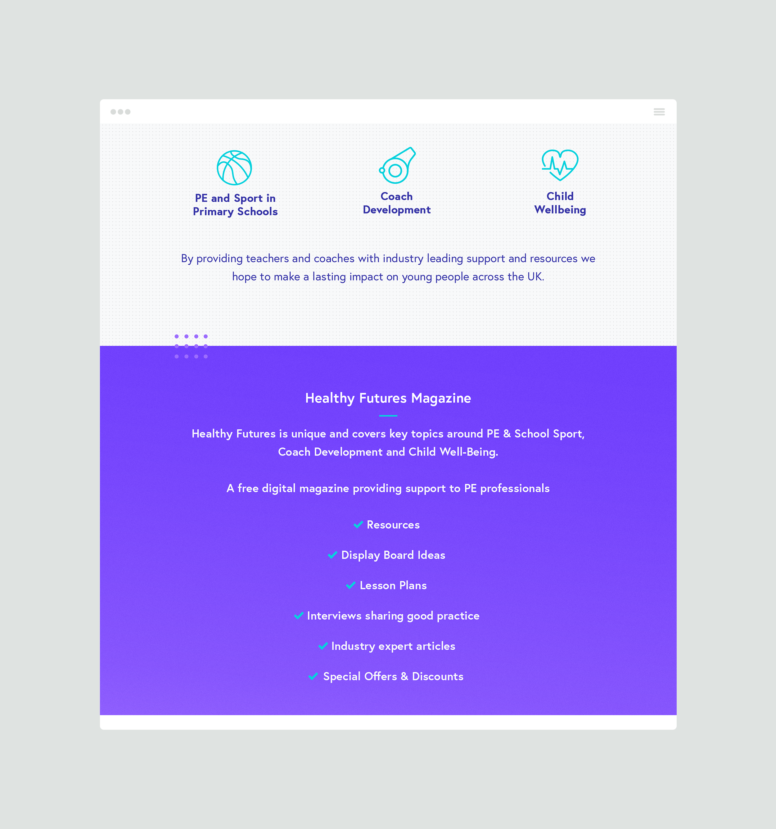
Their mission is to create and support the largest community of PE professionals across the UK, with 3 main focuses; Improving PE & School Sports, Increasing Physical Activity and Enhancing Health and Wellbeing.

Healthy Futures want to provide a forward-thinking platform for expert advice, guidance and resources, therefore it was imperative that the branding helps the brand communicate effectively in an informative manner but also reflects the energy and youthfulness throughout the visual identity.

The logo mark aims to form a fundamental connection with the audience through the aspiration of creating a better future. This concept is represented within the heart symbol itself with a directional path to guide you on a healthy and prosperous path.

Once the branding exercise was complete, a website was developed that would ensure the brand has the online impact it deserves. The website build is focused on the magazine, providing a point of contact and encouraging engagement with potential advertisers and contributors.
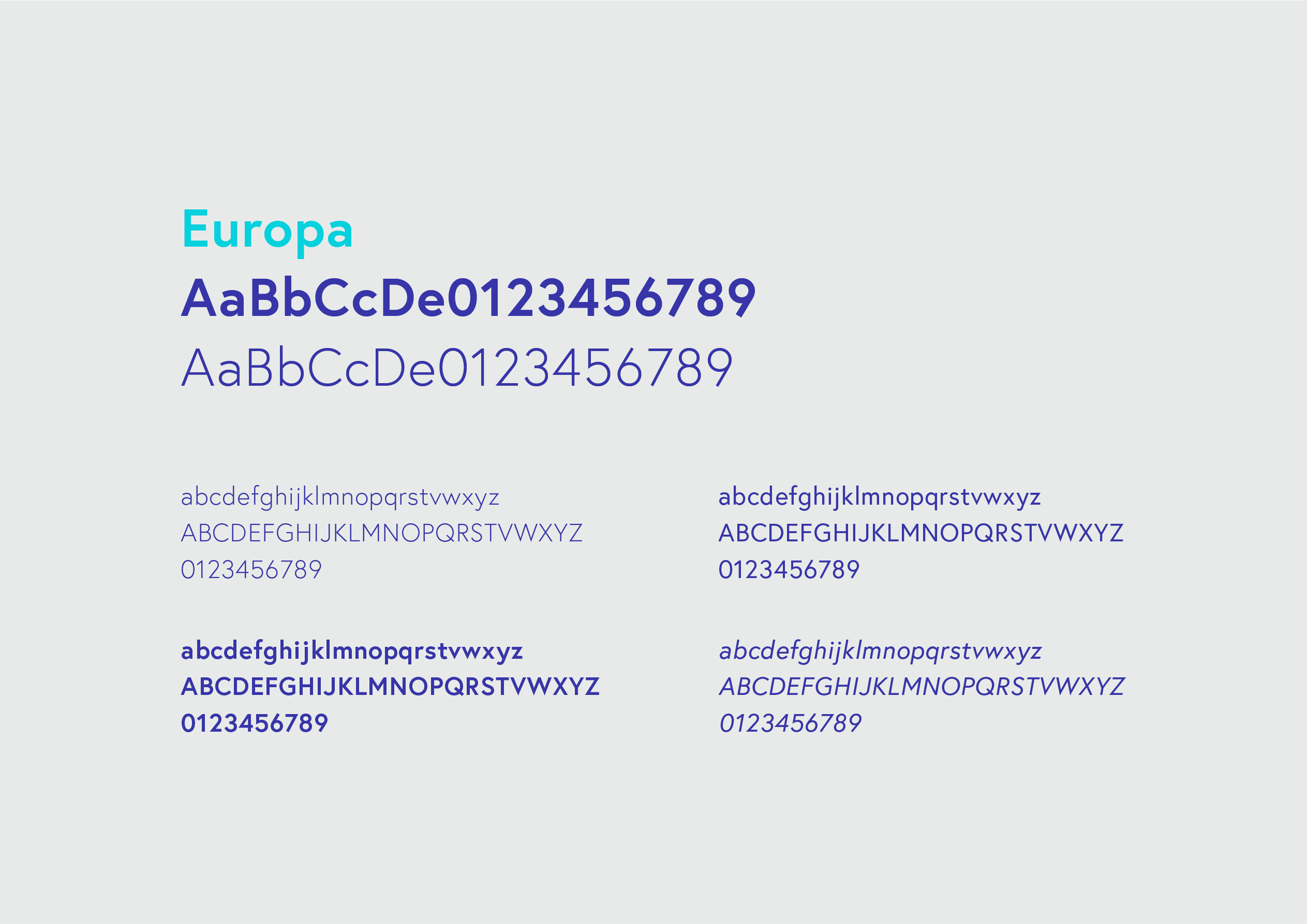
The website remained true to the brand itself through styling, the use of the colour palette and typeface; Europa. The website will ensure Healthy Futures has the platform needed to flourish and evolve.
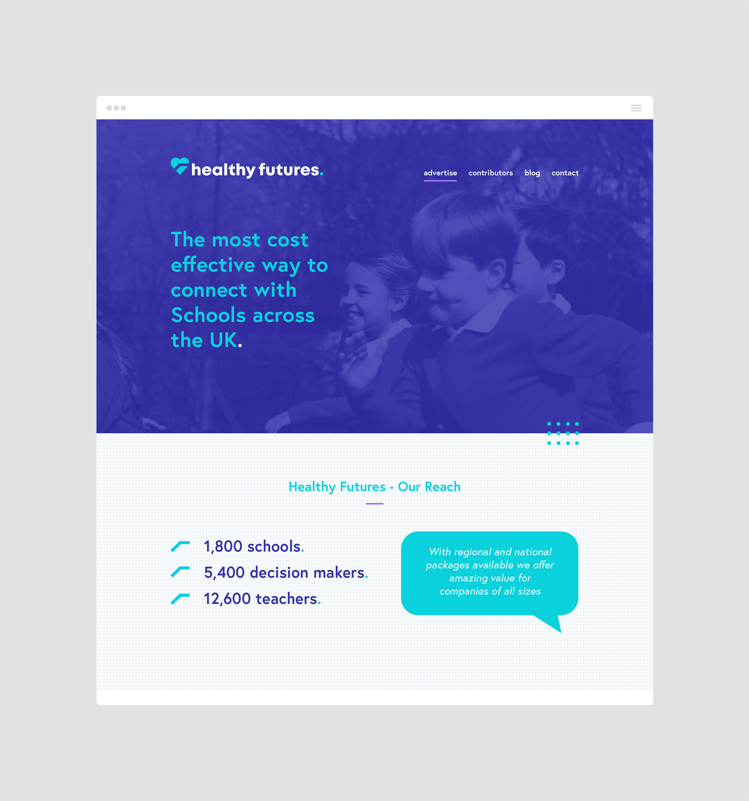
The Healthy Futures branding and website needed to be appealing, modern and project expertise and knowledge. It was essential that we created a brand identity that could communicate with energetic emotion but also display a calmer perspective when required.